
これまでいくつかの分類アルゴリズムを取り上げ、実装例を紹介してきた。

その中でデータの分布図の描画もしてきたが、今までは学習データとテストデータを同じ分布図に並べただけのものだった(下図のようなイメージ)。
最初はそれで妥協していたが、
これだとちゃんと学習できてるのかわからないな…
学習データとテストデータを分布図上で区別して、かつ学習で得た各カテゴリーの領域を図示できれば良いんだが…
と拘り心が首をもたげてきたので勉強してみた。
そして最終的に、データ分布図上で分類の領域を可視化し、さらに学習データとテストデータを見分けられるようにコードを改良できたので、ここで紹介する。
プログラム改良前後比較
まずは、ロジスティック回帰の実装例を用いて改良前後のプログラムを比較する。
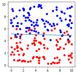
改良前のプログラム実装例と出力例は下記の通り。
プログラム実装例(改良前)
# モジュールのインポート
import numpy as np
import pandas as pd
import matplotlib.pyplot as plt
%matplotlib inline
from matplotlib.colors import ListedColormap
import sklearn
from sklearn.linear_model import LogisticRegression
from sklearn import metrics

# データセットのインポート
file=pd.read_csv('logistic.csv',header=None)

# データの割り振り
X=file.iloc[:,0:2]
Y=file.iloc[:,2]

# データセットを学習データ(8割)とテストデータ(2割)に分割(random_stateは0)
X_train, X_test, Y_train, Y_test = sklearn.model_selection.train_test_split(X, Y, test_size=0.2, random_state=0)

# 学習実行
# インスタンスの作成
model=LogisticRegression()
# モデルの作成
model.fit(X_train,Y_train)

# 学習データからの予測値
pred_train = model.predict(X_train)
# テストデータからの予測値
pred_test = model.predict(X_test)

# 学習データを用いた分類モデルの評価
print('正解率(学習データ) = ', metrics.accuracy_score(Y_train, pred_train))
# テストデータを用いた分類モデルの評価
print('正解率(テストデータ) = ', metrics.accuracy_score(Y_test, pred_test))


# データセットおよび直線の図示
plt.figure(figsize=(4,4))
plt.scatter(file.iloc[:,0], file.iloc[:,1],c=file.iloc[:,2], cmap=ListedColormap(['#FF0000', '#0000FF']))
plt.plot(file.iloc[:,0], -file.iloc[:,0]*model.coef_[0,0]/model.coef_[0,1]-model.intercept_[0]/model.coef_[0,1])
plt.show()
出力例(改良前)
正解率(学習データ) =  0.91875
正解率(テストデータ) =  0.875
このプログラムを書き直し、図を改良したものが下記である。
プログラム実装例(改良後)
# モジュールのインポート
import numpy as np
import pandas as pd
import matplotlib.pyplot as plt
%matplotlib inline
from matplotlib.colors import ListedColormap
import sklearn
from sklearn.linear_model import LogisticRegression
from sklearn import metrics

# データセットのインポート
file=pd.read_csv('logistic.csv',header=None)

# データの割り振り
X=file.iloc[:,0:2]
Y=file.iloc[:,2]

# データセットを学習データ(8割)とテストデータ(2割)に分割(random_stateは0)
X_train, X_test, Y_train, Y_test = sklearn.model_selection.train_test_split(X, Y, test_size=0.2, random_state=0)

# 学習実行
# インスタンスの作成
model=LogisticRegression()
# モデルの作成
model.fit(X_train,Y_train)

# 学習データからの予測値
pred_train = model.predict(X_train)
# テストデータからの予測値
pred_test = model.predict(X_test)

# 学習データを用いた分類モデルの評価
print('正解率(学習データ) = ', metrics.accuracy_score(Y_train, pred_train))
# テストデータを用いた分類モデルの評価
print('正解率(テストデータ) = ', metrics.accuracy_score(Y_test, pred_test))


# データセットおよび領域の図示開始
plt.figure(figsize=(4,4))

# カテゴリー領域の図示
x_min = X.iloc[:, 0].min() - 0.5 # 格子点のx座標最小値
x_max = X.iloc[:, 0].max() + 0.5 # 格子点のx座標最大値
y_min = X.iloc[:, 1].min() - 0.5 # 格子点のy座標最小値
y_max = X.iloc[:, 1].max() + 0.5 # 格子点のy座標最大値
h = 0.02 # 格子点生成のステップ数
xx, yy = np.meshgrid(np.arange(x_min, x_max, h), np.arange(y_min, y_max, h)) # 格子点生成
Z = model.predict(np.c_[xx.ravel(), yy.ravel()]) # 格子点全点の予測値算出
Z = Z.reshape(xx.shape) # 予測値の配列の形状をxx(yy)の形状に変更
plt.pcolormesh(xx, yy, Z, cmap=plt.cm.Paired) # 領域を図示

# 学習データおよびテストデータの図示
plt.scatter(X_train.iloc[:, 0], X_train.iloc[:, 1], c=Y_train , edgecolors='k', cmap=plt.cm.Paired , label='Training data')
plt.scatter(X_test.iloc[:, 0], X_test.iloc[:, 1], c=Y_test, edgecolors='k', cmap=plt.cm.Paired , s=150, marker="*" , label='Test data')

# 軸ラベルおよび凡例の表示
plt.xlabel('x')
plt.ylabel('y')
plt.legend(bbox_to_anchor=(1.05, 1), loc='upper left', borderaxespad=0, fontsize=14)

#図示
plt.show()
出力例(改良後)
正解率(学習データ) =  0.91875
正解率(テストデータ) =  0.875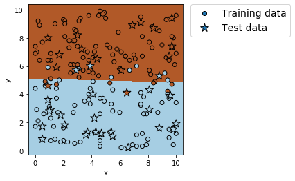
実際にプログラムを実行したい場合は、下記ボタンよりcsvファイル「logistic.csv」をダウンロードしてプログラムの保存先に保存すること。
ここで改めて図だけで比較する。
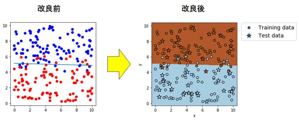
学習データを丸形、テストデータを星形のマーカーにして区別を図り、凡例を追加
また、学習で得たカテゴリー領域を色分けして可視化した。
ひとまず、やりたかったことは達成したとみていいだろう。
さて、肝心のコード部分。
気づいた人もいると思うが、図の描画コードの前にある、データの取り込みや学習のコードは一切変わっていない。
変わっているのは、図の描画コードのみだ。
# データセットおよび直線の図示
plt.figure(figsize=(4,4))
plt.scatter(file.iloc[:,0], file.iloc[:,1],c=file.iloc[:,2], cmap=ListedColormap(['#FF0000', '#0000FF']))
plt.plot(file.iloc[:,0], -file.iloc[:,0]*model.coef_[0,0]/model.coef_[0,1]-model.intercept_[0]/model.coef_[0,1])
plt.show()
が
# データセットおよび領域の図示開始
plt.figure(figsize=(4,4))

# カテゴリー領域の図示
x_min = X.iloc[:, 0].min() - 0.5 # 格子点のx座標最小値
x_max = X.iloc[:, 0].max() + 0.5 # 格子点のx座標最大値
y_min = X.iloc[:, 1].min() - 0.5 # 格子点のy座標最小値
y_max = X.iloc[:, 1].max() + 0.5 # 格子点のy座標最大値
h = 0.02 # 格子点生成のステップ数
xx, yy = np.meshgrid(np.arange(x_min, x_max, h), np.arange(y_min, y_max, h)) # 格子点生成
Z = model.predict(np.c_[xx.ravel(), yy.ravel()]) # 格子点全点の予測値算出
Z = Z.reshape(xx.shape) # 予測値の配列の形状をxx(yy)の形状に変更
plt.pcolormesh(xx, yy, Z, cmap=plt.cm.Paired) # 領域を図示

# 学習データおよびテストデータの図示
plt.scatter(X_train.iloc[:, 0], X_train.iloc[:, 1], c=Y_train , edgecolors='k', cmap=plt.cm.Paired , label='Training data')
plt.scatter(X_test.iloc[:, 0], X_test.iloc[:, 1], c=Y_test, edgecolors='k', cmap=plt.cm.Paired , s=150, marker="*" , label='Test data')

# 軸ラベルおよび凡例の表示
plt.xlabel('x')
plt.ylabel('y')
plt.legend(bbox_to_anchor=(1.05, 1), loc='upper left', borderaxespad=0, fontsize=14)

#図示
plt.show()
に変わっただけなのだ。
さらに言うとこの改良後の描画コードは、今まで紹介してきた他の分類アルゴリズムの実装例にもそのまま適用できるようになっている。
それに関してはおいおい話すとして、まずは改良後の描画コードを詳しく見ていこうと思う。
コード詳説
まず
plt.figure(figsize=(4,4))で図の描画領域(画用紙)を準備する。
x_min = X.iloc[:, 0].min() - 0.5 # 格子点のx座標最小値
x_max = X.iloc[:, 0].max() + 0.5 # 格子点のx座標最大値
y_min = X.iloc[:, 1].min() - 0.5 # 格子点のy座標最小値
y_max = X.iloc[:, 1].max() + 0.5 # 格子点のy座標最大値
は図を描画する際のx座標、およびy座標の最小値と最大値を指定するコード。
「.max」および「.min」をつけることで、各データ群の最大値および最小値を呼び出すことができる。
h = 0.02 # 格子点生成のステップ数
xx, yy = np.meshgrid(np.arange(x_min, x_max, h), np.arange(y_min, y_max, h)) # 格子点生成
は格子点の生成コードだ。
格子点とは、ある一定の間隔で座標を埋め尽くす点の集合と考えればよい。
下図は\(0\leq x \leq 5, 0\leq y \leq 5\)の範囲にピッチ1で並ぶ格子点である。
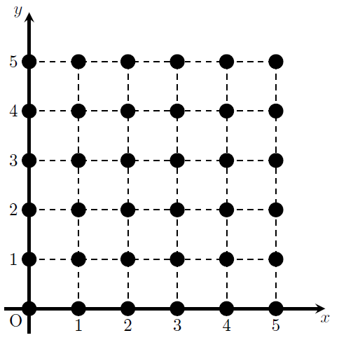
今回はx,yの最大・最小値の間で、ピッチ0.02で格子点を生成している。
「np.arange(最小値、最大値、ピッチ)」でxおよびyそれぞれの値を並べた配列を作り、「xx , yy = np.meshgrid(xの配列, yの配列)」で格子点を生成する。
とは言っても、厳密には格子点の座標(xとyを組み合わた配列)を生成しているわけではない。
「xx」ではxの配列「np.arange(x_min, x_max, h)」そのものがyの配列「np.arange(y_min, y_max, h)」の配列の要素の数だけ並んだものが生成される。
「yy」ではyの配列「np.arange(y_min, y_max, h)」の各要素がxの配列「np.arange(x_min, x_max, h)」の要素の数だけ並んだ配列が生成される。
例
xx, yy = np.meshgrid(np.arange(1, 4, 1), np.arange(4, 8, 2))を考える。
「np.arange(1, 4, 1)」は最小値1、最大値4、ピッチ1の配列だから出力は[1 2 3]となる(最大値は含まないことに注意)。
「np.arange(4, 8, 2)」は最小値4、最大値8、ピッチ2の配列だから出力は[4 6]となる。
このとき「xx」は、配列「np.arange(1, 4, 1)」すなわち[1 2 3]が、配列「np.arange(4, 8, 2)」すなわち[4 6]の要素の数(ここでは2)だけ出力されるから、出力結果は[1 2 3],[1 2 3]となる。
また「yy」は、配列「np.arange(4, 8, 2)」すなわち[4 6]の各要素(ここでは4と6)が、「xx」は、配列「np.arange(1, 4, 1)」の要素の数(ここでは3)だけ出力されるから、出力結果は[4 4 4],[6 6 6]となる。
Z = model.predict(np.c_[xx.ravel(), yy.ravel()]) # 格子点全点の予測値算出では、実際にxとyの2要素から成る格子点の配列(座標)を作り、各座標で目的変数の予測値を計算させている。
「xx.ravel()」および「yy.ravel()」は、「xx」および「yy」に格納されている配列をすべて1次元配列に結合させている。
そして「np.c_[xx.ravel(), yy.ravel()]」では、2つの1次元配列において同じ位置にある要素同士で2要素の1次元配列を作っている。
ここで初めて、全格子点の座標が配列の形で出力される。
例
xx, yy = np.meshgrid(np.arange(1, 4, 1), np.arange(4, 8, 2))
np.c_[xx.ravel(), yy.ravel()]
を考える。
「xx.ravel()」では、2つの配列[1 2 3],[1 2 3]が1つの1次元配列に結合されるから出力は[1 2 3 1 2 3]となる。
「yy.ravel()」も上記と同様に考えると出力は[4 4 4 6 6 6]となる。
よって「np.c_[xx.ravel(), yy.ravel()]」は、2つの1次元配列[1 2 3 1 2 3],[4 4 4 6 6 6]から同じ位置にある要素同士で2要素の1次元配列を作るため、出力は[1 4],[2 4],[3 4],[1 6],[2 6],[3 6]となる。
最後に「model.predict」で各格子点での予測値を計算するため、最終的な出力は、格子点数と同数の要素の0と1からなる1次元配列となる。
Z = Z.reshape(xx.shape) # 予測値の配列の形状をxx(yy)の形状に変更は上で出した予測値の1次元配列Zを、「xx」の配列構造に変えるコードである。
そして
plt.pcolormesh(xx, yy, Z, cmap=plt.cm.Paired) # 領域を図示で学習で得た領域を図示する。
「plt.pcolormesh(x,y,z,引数)」は等高線図の描画コードであり、zの大きさに応じて色を変えて描画する。
後はデータ点の図示とその他の装飾の表示コードだ。
# 学習データおよびテストデータの図示
plt.scatter(X_train.iloc[:, 0], X_train.iloc[:, 1], c=Y_train , edgecolors='k', cmap=plt.cm.Paired , label='Training data')
plt.scatter(X_test.iloc[:, 0], X_test.iloc[:, 1], c=Y_test, edgecolors='k', cmap=plt.cm.Paired , s=150, marker="*" , label='Test data')
にて学習データとテストデータを図示する。
コードを分けたのはマーカーの種類を変えて区別するため。
そして
# 軸ラベルおよび凡例の表示
plt.xlabel('x')
plt.ylabel('y')
plt.legend(bbox_to_anchor=(1.05, 1), loc='upper left', borderaxespad=0, fontsize=14)

#図示
plt.show()
が軸ラベルと凡例の表示コードと、全ての図をJupyter Notebook上に表示するコードである。
他の分類アルゴリズムに適用
最後に、今まで紹介してきた分類アルゴリズムのプログラムに上記の描画コードを適用した結果を見てみる。
実際にプログラムを実行したい場合は、下記ボタンよりcsvファイル「logistic.csv」「NSVM.csv」「tree.csv」をダウンロードしてプログラムの保存先に保存すること。
線形SVM
適用後プログラム
# モジュールのインポート
import numpy as np
import pandas as pd
import matplotlib.pyplot as plt
%matplotlib inline
from matplotlib.colors import ListedColormap
import sklearn
from sklearn.svm import LinearSVC
from sklearn import metrics

# データセットのインポート
file=pd.read_csv('logistic.csv',header=None)

# データの割り振り
X=file.iloc[:,0:2]
Y=file.iloc[:,2]

# データセットを学習データ(8割)とテストデータ(2割)に分割(random_stateは0)
X_train, X_test, Y_train, Y_test = sklearn.model_selection.train_test_split(X, Y, test_size=0.2, random_state=0)
# 分割の確認
print('分割の確認:',X_train.shape, X_test.shape, Y_train.shape, Y_test.shape)

# 学習実行
# インスタンスの作成
model=LinearSVC(max_iter=10000)
# モデルの作成
model.fit(X_train,Y_train)

# 直線の確認
# 切片
print('切片の値 = ', model.intercept_)
# 係数
print('係数の値 = ', model.coef_)

# 学習データからの予測値
pred_train = model.predict(X_train)
# テストデータからの予測値
pred_test = model.predict(X_test)

# 学習データを用いた分類モデルの評価
print('正解率(学習データ) = ', metrics.accuracy_score(Y_train, pred_train))
print('適合率(学習データ) = ', metrics.precision_score(Y_train, pred_train))
print('再現率(学習データ) = ', metrics.recall_score(Y_train, pred_train))
print('F値(学習データ) = ', metrics.f1_score(Y_train, pred_train))

# テストデータを用いた分類モデルの評価
print('正解率(テストデータ) = ', metrics.accuracy_score(Y_test, pred_test))
print('適合率(テストデータ) = ', metrics.precision_score(Y_test, pred_test))
print('再現率(テストデータ) = ', metrics.recall_score(Y_test, pred_test))
print('F値(テストデータ) = ', metrics.f1_score(Y_test, pred_test))

# データセットおよび領域の図示開始
plt.figure(figsize=(4,4))

# カテゴリー領域の図示
x_min = X.iloc[:, 0].min() - 0.5 # 格子点のx座標最小値
x_max = X.iloc[:, 0].max() + 0.5 # 格子点のx座標最大値
y_min = X.iloc[:, 1].min() - 0.5 # 格子点のy座標最小値
y_max = X.iloc[:, 1].max() + 0.5 # 格子点のy座標最大値
h = 0.02 # 格子点生成のステップ数
xx, yy = np.meshgrid(np.arange(x_min, x_max, h), np.arange(y_min, y_max, h)) # 格子点生成
Z = model.predict(np.c_[xx.ravel(), yy.ravel()]) # 格子点全点の予測値算出
Z = Z.reshape(xx.shape) # 予測値の配列の形状をxx(yy)の形状に変更
plt.pcolormesh(xx, yy, Z, cmap=plt.cm.Paired) # 領域を図示

# 学習データおよびテストデータの図示
plt.scatter(X_train.iloc[:, 0], X_train.iloc[:, 1], c=Y_train , edgecolors='k', cmap=plt.cm.Paired , label='Training data')
plt.scatter(X_test.iloc[:, 0], X_test.iloc[:, 1], c=Y_test, edgecolors='k', cmap=plt.cm.Paired , s=150, marker="*" , label='Test data')

# 軸ラベルおよび凡例の表示
plt.xlabel('x')
plt.ylabel('y')
plt.legend(bbox_to_anchor=(1.05, 1), loc='upper left', borderaxespad=0, fontsize=14)

#図示
plt.show()
出力例
分割の確認: (160, 2) (40, 2) (160,) (40,)
切片の値 =  [-2.70070964]
係数の値 =  [[-0.00084902  0.54778781]]
正解率(学習データ) =  0.90625
適合率(学習データ) =  0.9080459770114943
再現率(学習データ) =  0.9186046511627907
F値(学習データ) =  0.9132947976878613
正解率(テストデータ) =  0.875
適合率(テストデータ) =  0.8125
再現率(テストデータ) =  0.8666666666666667
F値(テストデータ) =  0.8387096774193549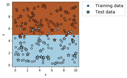
非線形SVM
適用後プログラム
# モジュールのインポート
import numpy as np
import pandas as pd
import matplotlib.pyplot as plt
%matplotlib inline
from matplotlib.colors import ListedColormap
import sklearn
from sklearn.svm import SVC
from sklearn import metrics

# データセットのインポート
file=pd.read_csv('NSVM.csv',header=None)

# データの割り振り
X=file.iloc[:,0:2]
Y=file.iloc[:,2]

# データセットを学習データ(8割)とテストデータ(2割)に分割(random_stateは0)
X_train, X_test, Y_train, Y_test = sklearn.model_selection.train_test_split(X, Y, test_size=0.2, random_state=0)
# 分割の確認
print('分割の確認:',X_train.shape, X_test.shape, Y_train.shape, Y_test.shape)

# 学習実行
# インスタンスの作成
model=SVC()
# モデルの作成
model.fit(X_train,Y_train)

# 学習データからの予測値
pred_train = model.predict(X_train)
# テストデータからの予測値
pred_test = model.predict(X_test)

# 学習データを用いた分類モデルの評価
print('正解率(学習データ) = ', metrics.accuracy_score(Y_train, pred_train))
print('適合率(学習データ) = ', metrics.precision_score(Y_train, pred_train))
print('再現率(学習データ) = ', metrics.recall_score(Y_train, pred_train))
print('F値(学習データ) = ', metrics.f1_score(Y_train, pred_train))

# テストデータを用いた分類モデルの評価
print('正解率(テストデータ) = ', metrics.accuracy_score(Y_test, pred_test))
print('適合率(テストデータ) = ', metrics.precision_score(Y_test, pred_test))
print('再現率(テストデータ) = ', metrics.recall_score(Y_test, pred_test))
print('F値(テストデータ) = ', metrics.f1_score(Y_test, pred_test))

# データセットおよび領域の図示開始
plt.figure(figsize=(4,4))

# カテゴリー領域の図示
x_min = X.iloc[:, 0].min() - 0.5 # 格子点のx座標最小値
x_max = X.iloc[:, 0].max() + 0.5 # 格子点のx座標最大値
y_min = X.iloc[:, 1].min() - 0.5 # 格子点のy座標最小値
y_max = X.iloc[:, 1].max() + 0.5 # 格子点のy座標最大値
h = 0.02 # 格子点生成のステップ数
xx, yy = np.meshgrid(np.arange(x_min, x_max, h), np.arange(y_min, y_max, h)) # 格子点生成
Z = model.predict(np.c_[xx.ravel(), yy.ravel()]) # 格子点全点の予測値算出
Z = Z.reshape(xx.shape) # 予測値の配列の形状をxx(yy)の形状に変更
plt.pcolormesh(xx, yy, Z, cmap=plt.cm.Paired) # 領域を図示

# 学習データおよびテストデータの図示
plt.scatter(X_train.iloc[:, 0], X_train.iloc[:, 1], c=Y_train , edgecolors='k', cmap=plt.cm.Paired , label='Training data')
plt.scatter(X_test.iloc[:, 0], X_test.iloc[:, 1], c=Y_test, edgecolors='k', cmap=plt.cm.Paired , s=150, marker="*" , label='Test data')

# 軸ラベルおよび凡例の表示
plt.xlabel('x')
plt.ylabel('y')
plt.legend(bbox_to_anchor=(1.05, 1), loc='upper left', borderaxespad=0, fontsize=14)

#図示
plt.show()
出力例
分割の確認: (80, 2) (20, 2) (80,) (20,)
正解率(学習データ) =  0.975
適合率(学習データ) =  1.0
再現率(学習データ) =  0.9230769230769231
F値(学習データ) =  0.9600000000000001
正解率(テストデータ) =  1.0
適合率(テストデータ) =  1.0
再現率(テストデータ) =  1.0
F値(テストデータ) =  1.0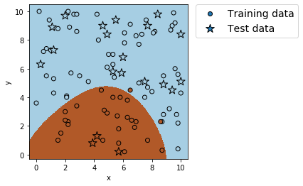
決定木
適用後プログラム
# モジュールのインポート
import numpy as np
import pandas as pd
import matplotlib.pyplot as plt
%matplotlib inline
from matplotlib.colors import ListedColormap
import sklearn
from sklearn.tree import DecisionTreeClassifier
from sklearn import metrics

# データセットのインポート
file=pd.read_csv('tree.csv')

# データの割り振り
X=file.iloc[:,0:2]
Y=file.iloc[:,2]

# データセットを学習データ(8割)とテストデータ(2割)に分割(random_stateは0)
X_train, X_test, Y_train, Y_test = sklearn.model_selection.train_test_split(X, Y, test_size=0.2, random_state=0)
# 分割の確認
print('分割の確認:',X_train.shape, X_test.shape, Y_train.shape, Y_test.shape)

# 学習実行
# インスタンスの作成
model = DecisionTreeClassifier(max_depth=2)
# モデルの作成
model.fit(X_train, Y_train)

# 学習データからの予測値
pred_train = model.predict(X_train)
# テストデータからの予測値
pred_test = model.predict(X_test)

# 学習データを用いた分類モデルの評価
print('正解率(学習データ) = ', metrics.accuracy_score(Y_train, pred_train))

# テストデータを用いた分類モデルの評価
print('正解率(テストデータ) = ', metrics.accuracy_score(Y_test, pred_test))

# データセットおよび領域の図示開始
plt.figure(figsize=(4,4))

# カテゴリー領域の図示
x_min = X.iloc[:, 0].min() - 0.5 # 格子点のx座標最小値
x_max = X.iloc[:, 0].max() + 0.5 # 格子点のx座標最大値
y_min = X.iloc[:, 1].min() - 0.5 # 格子点のy座標最小値
y_max = X.iloc[:, 1].max() + 0.5 # 格子点のy座標最大値
h = 0.02 # 格子点生成のステップ数
xx, yy = np.meshgrid(np.arange(x_min, x_max, h), np.arange(y_min, y_max, h)) # 格子点生成
Z = model.predict(np.c_[xx.ravel(), yy.ravel()]) # 格子点全点の予測値算出
Z = Z.reshape(xx.shape) # 予測値の配列の形状をxx(yy)の形状に変更
plt.pcolormesh(xx, yy, Z, cmap=plt.cm.Paired) # 領域を図示

# 学習データおよびテストデータの図示
plt.scatter(X_train.iloc[:, 0], X_train.iloc[:, 1], c=Y_train , edgecolors='k', cmap=plt.cm.Paired , label='Training data')
plt.scatter(X_test.iloc[:, 0], X_test.iloc[:, 1], c=Y_test, edgecolors='k', cmap=plt.cm.Paired , s=150, marker="*" , label='Test data')

# 軸ラベルおよび凡例の表示
plt.xlabel('x')
plt.ylabel('y')
plt.legend(bbox_to_anchor=(1.05, 1), loc='upper left', borderaxespad=0, fontsize=14)

#図示
plt.show()
出力例
分割の確認: (80, 2) (20, 2) (80,) (20,)
正解率(学習データ) =  1.0
正解率(テストデータ) =  1.0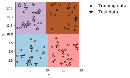
k近傍法
適用後プログラム
import numpy as np
import pandas as pd
import matplotlib.pyplot as plt
%matplotlib inline
from matplotlib.colors import ListedColormap
import sklearn
from sklearn.neighbors import KNeighborsClassifier
from sklearn import metrics

# データセットのインポート
file=pd.read_csv('tree.csv')

# データの割り振り
X=file.iloc[:,0:2]
Y=file.iloc[:,2]

# データセットを学習データ(8割)とテストデータ(2割)に分割(random_stateは0)
X_train, X_test, Y_train, Y_test = sklearn.model_selection.train_test_split(X, Y, test_size=0.2, random_state=0)
# 分割の確認
print('分割の確認:',X_train.shape, X_test.shape, Y_train.shape, Y_test.shape)

# 学習実行
# インスタンスの作成
model = KNeighborsClassifier(n_neighbors = 5)
# モデルの作成
model.fit(X_train, Y_train)

# 学習データからの予測値
pred_train = model.predict(X_train)
# テストデータからの予測値
pred_test = model.predict(X_test)

# 学習データを用いた分類モデルの評価
print('正解率(学習データ) = ', metrics.accuracy_score(Y_train, pred_train))

# テストデータを用いた分類モデルの評価
print('正解率(テストデータ) = ', metrics.accuracy_score(Y_test, pred_test))

# データセットおよび領域の図示開始
plt.figure(figsize=(4,4))

# カテゴリー領域の図示
x_min = X.iloc[:, 0].min() - 0.5 # 格子点のx座標最小値
x_max = X.iloc[:, 0].max() + 0.5 # 格子点のx座標最大値
y_min = X.iloc[:, 1].min() - 0.5 # 格子点のy座標最小値
y_max = X.iloc[:, 1].max() + 0.5 # 格子点のy座標最大値
h = 0.02 # 格子点生成のステップ数
xx, yy = np.meshgrid(np.arange(x_min, x_max, h), np.arange(y_min, y_max, h)) # 格子点生成
Z = model.predict(np.c_[xx.ravel(), yy.ravel()]) # 格子点全点の予測値算出
Z = Z.reshape(xx.shape) # 予測値の配列の形状をxx(yy)の形状に変更
plt.pcolormesh(xx, yy, Z, cmap=plt.cm.Paired) # 領域を図示

# 学習データおよびテストデータの図示
plt.scatter(X_train.iloc[:, 0], X_train.iloc[:, 1], c=Y_train , edgecolors='k', cmap=plt.cm.Paired , label='Training data')
plt.scatter(X_test.iloc[:, 0], X_test.iloc[:, 1], c=Y_test, edgecolors='k', cmap=plt.cm.Paired , s=150, marker="*" , label='Test data')

# 軸ラベルおよび凡例の表示
plt.xlabel('x')
plt.ylabel('y')
plt.legend(bbox_to_anchor=(1.05, 1), loc='upper left', borderaxespad=0, fontsize=14)

#図示
plt.show()
出力例 (k近傍法では図の出力に時間がかかるので注意)
分割の確認: (80, 2) (20, 2) (80,) (20,)
正解率(学習データ) =  1.0
正解率(テストデータ) =  1.0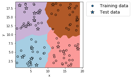
これらすべてのプログラムは、参照元のプログラムの図の描画コード部分を書き換えただけだ。
終わりに
かなり長くなってしまったが、やりたいことは達成できたので良しとする。
やっぱりこうやって少しずつできることが増えていくのは面白い。
ただ今回はかなり長いものを書いてしまったので、少し休もうか…
参照記事

END


コメント